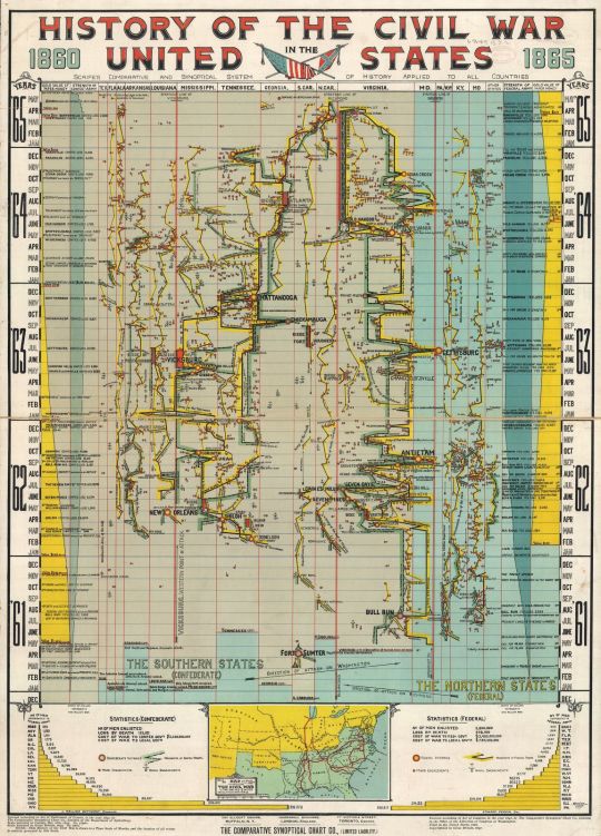
This chart, using Arthur Hodgkin Scaife’s “Comparative and Synoptical System of History,” depicts major battles, troop losses, skirmishes, and other events of the American Civil War. It was published by the Comparative Synoptical Chart Company, with offices in Buffalo, New York, London, England, and Toronto, Canada, and was filed with the U.S. copyright authority—the Librarian of Congress—in 1896 and copyrighted in Great Britain in 1897. The original chart/map is in the collections of the Library of Congress.
This is not a geographical map, but a historical time chart. Scaife’s method of creating charts aimed to present as much information as possible in a single chart. The history of the Civil War is “drawn to a time scale of months, and the location of all events is entirely governed by this scale.” The chart starts with 1861 at the bottom and moves through to May 1865 at the top. Along the top you find columns for the gold value of paper money (shown in yellow) and another for strength of the armies (shown in teal)—with the Confederacy’s columns for those two things on the far left and the Federal columns on the far right.
In the middle are columns for the various states where battles took place. Virginia has the widest column indicating more battles took place there than anywhere else, with Mississippi and Tennessee not far behind. Pennsylvania’s column is just wide enough to accommodate the large circle used to represent the Battle of Gettysburg, the only major battle to take place in Pennsylvania. The size of the circles indicates the importance of battles, and the color inside the large circles indicates which side won that battle.
The lines zig-zagging between the state columns indicate the movement of troops. Little anchors show naval engagements.
At the bottom of the chart is a “Map illustrating the Civil War in the United States shewing principal battle fields, &c, 1861 to 1865, from Colton’s “Atlas” pub: N. York.” To either side of it are bar charts showing the number of men contributed to the Confederate Army (left side of map) and to the Federal Army (right side), by state. Also supplied in that area are statistics for the total number of men enlisted, total loss by death, and the total cost of the war to the national government and to the local governments.
Do you find this chart confusing, or a really cool way of looking at the various data presented?
If you click on the image it will take you to a version of the image—on the Library of Congress’ website—that can be enlarged somewhat.
Other Civil War maps in the Library of Congress can be found in the Collections with Maps, Civil War Maps webpages.
